
the brief
As part of a school project based on a real client brief, our team of five was selected to work on the rebranding of Lisboète Magazine. The client approached the school with the goal of revitalising the magazine’s identity, designing its 16th issue, and establishing a reusable layout system for future editions.
Lisboète is a quarterly publication aiming to become the go-to resource for French-speaking expats navigating life in Lisbon. It positions itself as a premium lifestyle and integration guide, offering high-quality content, thoughtful design, and useful services.
In response to a shared team concept, each of us developed an individual creative direction. My proposal was built around the idea of “Anchoring Down.” As expats adjust to a new environment, they experience constant change - the magazine becomes a stable, familiar point of reference that supports them through the process of integration.
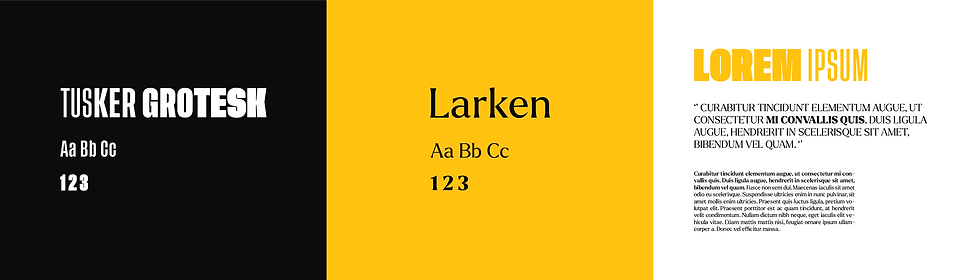
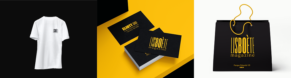
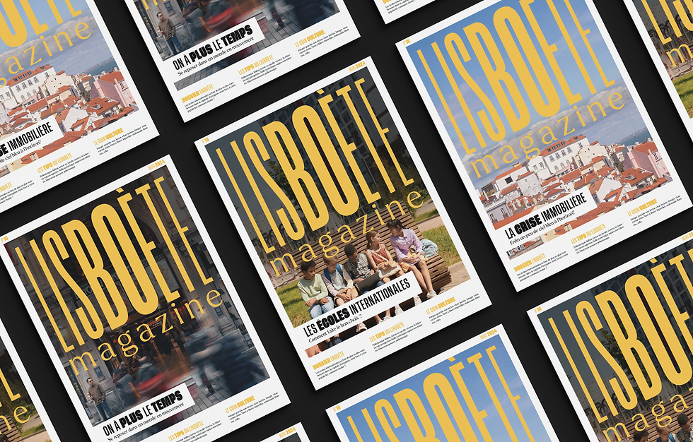
The resulting visual identity reflects that sense of grounding, with a design system that balances warmth and clarity. It supports the brand’s mission to feel both refined and relatable, while offering a consistent framework for future content.
2024
lisboète magazine
lisboète magazine
branding
2024
lisboète magazine
lisboète magazine
branding
THE BRIEF
As part of a school project based on a real client brief, our team of five was selected to work on the rebranding of Lisboète Magazine. The client approached the school with the goal of revitalising the magazine’s identity, designing its 16th issue, and establishing a reusable layout system for future editions.
Lisboète is a quarterly publication aiming to become the go-to resource for French-speaking expats navigating life in Lisbon. It positions itself as a premium lifestyle and integration guide, offering high-quality content, thoughtful design, and useful services.
In response to a shared team concept, each of us developed an individual creative direction. My proposal was built around the idea of “Anchoring Down.” As expats adjust to a new environment, they experience constant change - the magazine becomes a stable, familiar point of reference that supports them through the process of integration.
The resulting visual identity reflects that sense of grounding, with a design system that balances warmth and clarity. It supports the brand’s mission to feel both refined and relatable, while offering a consistent framework for future content.