2023
minimaximal sound system records
school project
branding
THE BRIEF
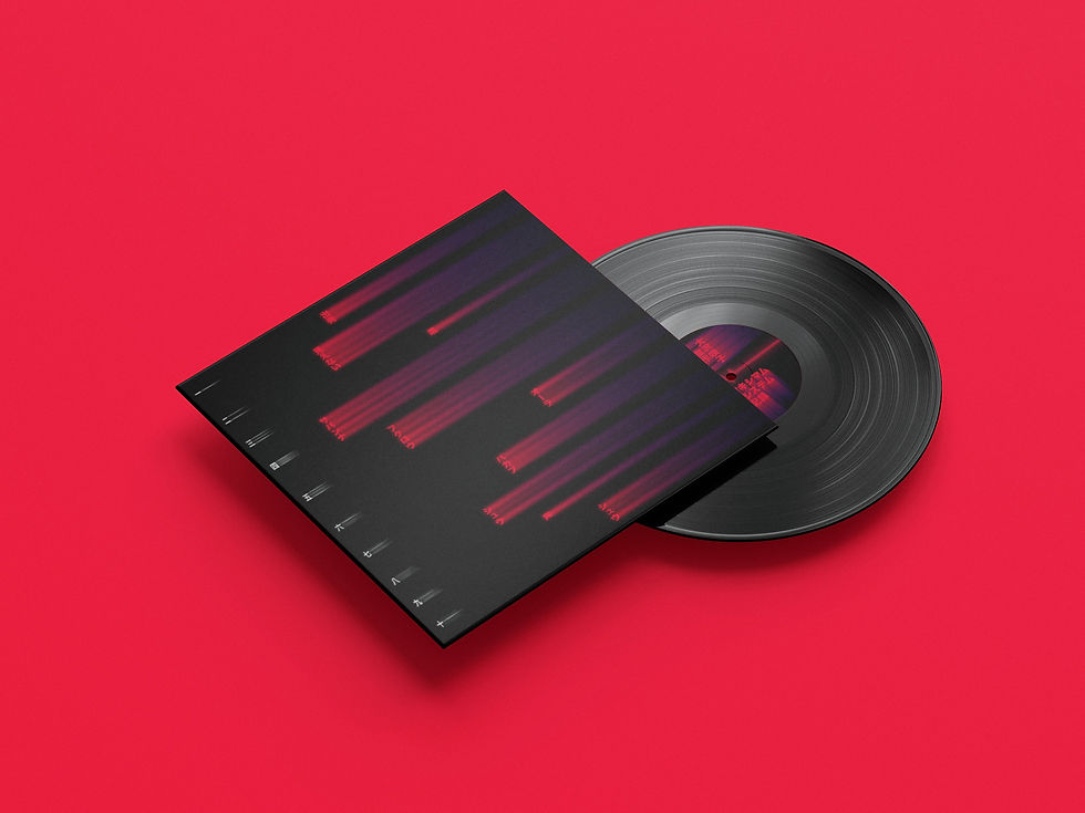
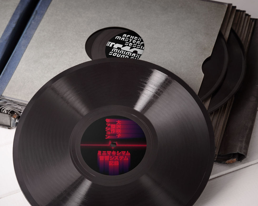
As part of a school project exploring visual identity systems, we were introduced to Minimaximal Sound System Records, a fictional record label created to celebrate the work of influential techno artists through curated compilation albums. The brand’s visual identity — built around a modular, repeating "M" pattern — served as the foundation for the entire collection.
The first volume, designed by our instructor and dedicated to Aphex Twin, established a strong visual language rooted in minimalism, structure, and repetition. Our task was to extend this identity system by designing the next release in the series, each student selecting their own artist and adapting the "M" concept accordingly.
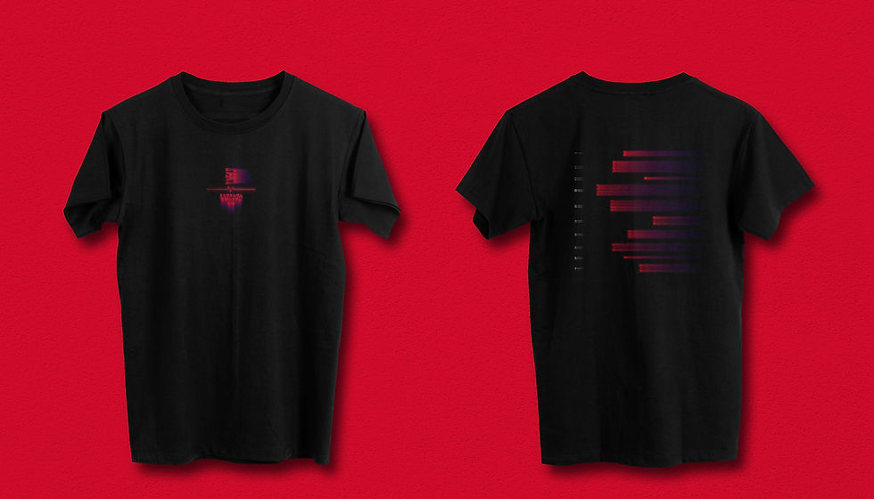
The challenge lay in preserving the coherence of the overarching brand while tailoring the aesthetic to reflect the unique sonic world of a different musician. Through careful manipulation of the core visual motif, typography, and composition, the result was a series of designs that honored the label’s minimal roots while expressing the diversity of its imagined roster.
This project was a study in creative restraint — showing how much personality can emerge from a single conceptual seed.
the brief
As part of a school project exploring visual identity systems, we were introduced to Minimaximal Sound System Records, a fictional record label created to celebrate the work of influential techno artists through curated compilation albums. The brand’s visual identity — built around a modular, repeating "M" pattern — served as the foundation for the entire collection.
The first volume, designed by our instructor and dedicated to Aphex Twin, established a strong visual language rooted in minimalism, structure, and repetition. Our task was to extend this identity system by designing the next release in the series, each student selecting their own artist and adapting the "M" concept accordingly.
The challenge lay in preserving the coherence of the overarching brand while tailoring the aesthetic to reflect the unique sonic world of a different musician. Through careful manipulation of the core visual motif, typography, and composition, the result was a series of designs that honored the label’s minimal roots while expressing the diversity of its imagined roster.
This project was a study in creative restraint — showing how much personality can emerge from a single conceptual seed.
2023
minimaximal sound system records
school project
branding
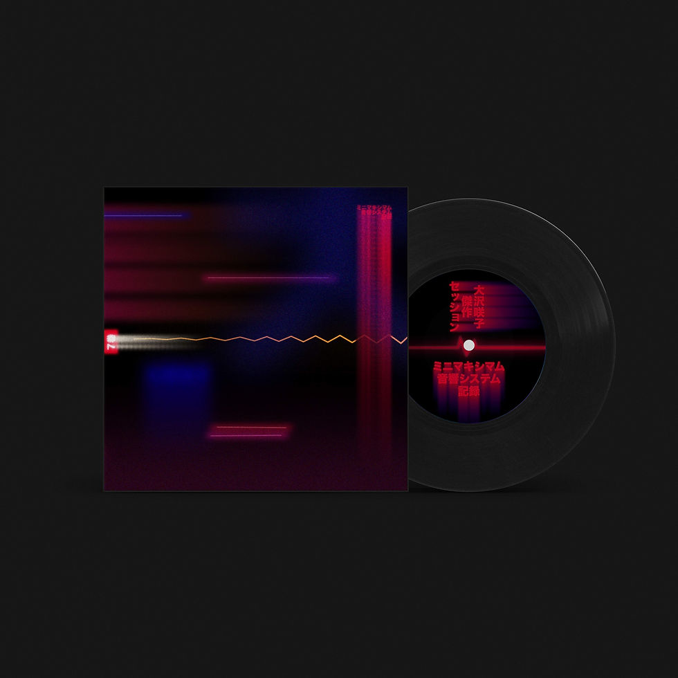
aphex twin:


For this part of the project, we also had to create a secondary cover for the Aphex Twin vinyl. This cover had to represent one song in particular (in my case "Pancake Lizard") and we had to visually transcribe every single note of the song to create an art piece.

sakiko osawa:

.jpg)